Everyone in Germany is speaking about the 2nd wave of Covid-19. Has it already
arrived, is it still coming?
The number of new Covid-19 cases is rising for quite a few weeks According to
Johns Hopkins University there were more
than 1,000 new cases per day in the last days.
That was also the case when there was only a local hotspot in Gütersloh and Warendorf occurred.
But this time there isn’t one hotspot. The infected people live all over
Germany.
So I want to visualize the spreading.
The data
Pavel Mayer produces every day a very detailed table with Covid-19 data per Landkreis.
(Landkreis is an sub-area of a Bundesland such as a county of a state in the U.S.)
He uses data provided by German Robert-Koch-Institut (RKI)
and adds some data from other sources and tries to clean up the data.
He offers the data for download, too.
I’m using this data for my visualization. I can’t get exactly the same numbers
as Pavel does. I’m not sure what the reason is for the difference. As I’m using
the date a case was reported. Maybe he uses the date of infection.
Update 2020-08-14: The reason for the difference between my calculated values and
Pavel’s is a different date: I’m calculating the number of infections which are
detected on a special day (MeldedatumKlar). Pavel refers his calculated infections
to the day they are reported by the RKI (Datenstand). Note: There may be a delay of several days
between testing and getting the positive result to the local health department on
one hand and sending this data to the RKI. They still use FAX in 2020!
So let’s start:
1
2
3
4
5
6
7
|
# Load Libraries
suppressMessages(library(tidyverse))
suppressMessages(library(lubridate))
suppressMessages(library(zoo))

# Suppress summarise info
options(dplyr.summarise.inform = FALSE)
|
 1
 2
 3
 4
 5
 6
 7
 8
 9
10
11
12
13
14
15
16
17
18
19
20
21
22
23
24
25
26
27
|
# Fetch the data
url_landkreise_full <- "https://pavelmayer.de/covid/risks/full-data.csv"

if(file.exists("data_landkreise_detail.Rda")){
  load("data_landkreise_detail.Rda")
} else{
  data_landkreise_detail <- read_csv(url_landkreise_full, col_types = cols(
    Bundesland = col_character(),
    Landkreis = col_character(),
    Altersgruppe = col_character(),
    Geschlecht = col_character(),
    IdLandkreis = col_character(),
    Datenstand = col_character(),
    Altersgruppe2 = col_character(),
    LandkreisName = col_character(),
    LandkreisTyp = col_character(),
    NeuerFallKlar = col_character(),
    RefdatumKlar = col_character(),
    MeldedatumKlar = col_character(),
    NeuerTodesfallKlar = col_character(),
    missingSinceDay = col_integer(),
    missingCasesInOldRecord = col_integer(),
    poppedUpOnDay = col_integer()
    )
  )
  save(data_landkreise_detail, file = "data_landkreise_detail.Rda")
}
|
The date when an infection is reported is coded in MeldedatumKlar. So let’s
transform it to a date column:
1
2
|
# Set locale to German because there's the German notation of the weekday used
Sys.setlocale(category = "LC_ALL", locale = "de_DE.UTF-8")
|
1
|
## [1] "de_DE.UTF-8/de_DE.UTF-8/de_DE.UTF-8/C/de_DE.UTF-8/C"
|
1
2
3
4
5
6
7
|
# change MeldedatumKlar to date
data_landkreise_detail_converted <- data_landkreise_detail %>%
  mutate(
    MeldedatumKlar = as.Date(
      strptime(MeldedatumKlar, format = "%a, %d.%m.%Y %H:%M")
    )
  )
|
We want to visualize the infections during the last 7 days. So let’s compute them.
 1
 2
 3
 4
 5
 6
 7
 8
 9
10
11
12
13
|
data_landkreise_per_day <- data_landkreise_detail_converted %>%
  arrange(MeldedatumKlar) %>%
  group_by(Landkreis, MeldedatumKlar) %>%
  summarize(
    infected = sum(AnzahlFall)
  ) %>%
  ungroup() %>%
  complete(MeldedatumKlar, Landkreis, fill = list(infected = 0)) %>%
  arrange(MeldedatumKlar) %>%
  group_by(Landkreis) %>%
  mutate(
    infected_7 = rollsum(infected, 7, fill = NA, align = "right")
  )
|
In Germany there is a rule that each Landkreis with more than 50 newly infected
people per 100,000 residents during the last 7 days must take care of the situation such as restrictions
for meeting other people or closing parks, bars and restaurants etc. So we need the number of residents
per Landkreis.
Pavel provides this data already in his dataset. He also provides an id (IdLandkreis) for each
landkreis we will need later. So let’s extract these two fields out of the
original data and merge them into the summarized data.frame:
1
2
3
4
5
6
7
8
9
|
landkreise <- data_landkreise_detail_converted %>%
  select(Landkreis, IdLandkreis, Bevoelkerung) %>%
  unique()

data_landkreise_per_day_per_100k <- data_landkreise_per_day %>%
  left_join(landkreise) %>%
  mutate(
    infected_7_per_100k = infected_7/ Bevoelkerung * 100000
  )
|
1
|
## Joining, by = "Landkreis"
|
A first map
So now we want to plot this data into a map.
ggplot2 provides some maps such as map_data("world"). Unfortunatly German Landkreise
aren’t (yet) available.
So we need to fecth them on our own:
1
2
3
4
5
6
|
# Don't load the whole raster library because it overwrites the select method from dplyr.
# library(raster)
suppressMessages(library(rgeos))
suppressMessages(library(maptools))
suppressMessages(library(scales))
suppressMessages(library(ggmap))
|
1
2
3
4
5
6
7
|
# Fetch data for Landkreise
landkreise.shp <- raster::getData("GADM", country = "DEU", level = 2)
landkreise.shp.f <- fortify(landkreise.shp, region = "CC_2")
landkreise.shp.f <- landkreise.shp.f

# Fetch data for Bundesländer
laender.shp <- raster::getData("GADM", country = "DEU", level = 1)
|
Now we need to subset our data to a specific date. Let’s have a look at 2020-03-27:
1
2
3
4
5
6
7
8
|
plot_date <- ymd("2020-03-27")

mydata <- data_landkreise_per_day_per_100k %>%
  filter(MeldedatumKlar == plot_date) %>%
  rename(id = IdLandkreis)

## merge shape file with data
merge.shp.coef <- full_join(landkreise.shp.f, mydata, by = "id")
|
Now we can plot the data.
 1
 2
 3
 4
 5
 6
 7
 8
 9
10
11
12
13
14
15
16
|
single_map <-  function(merge.shp.coef, landkreise.shp.f){
  ggplot() +
    geom_polygon(data = merge.shp.coef, aes(x = long, y = lat, group = group,
                                                     fill = infected_7_per_100k), color = "black", size = 0.25) +
    geom_polygon(data = laender.shp, aes(x = long, y = lat, group = group),
                                            alpha = 0, color = "black", size = 1.0) +
    coord_map() +
    scale_fill_gradient2(midpoint = 15, low = "green", mid = "yellow",
                          high = "red", space = "Lab", limits=c(0, 50), oob=squish,
                         name = "Number of infections per 100k (50 is 50+)") +
    theme_nothing(legend = TRUE) +
    labs(
      title = paste0("Infections per 100.000 Residents during last 7 days at ",
                        format(plot_date, format = "%m/%d/%Y"))
    )
}
|
1
|
single_map(merge.shp.coef, landkreise.shp.f)
|
1
|
## Regions defined for each Polygons
|
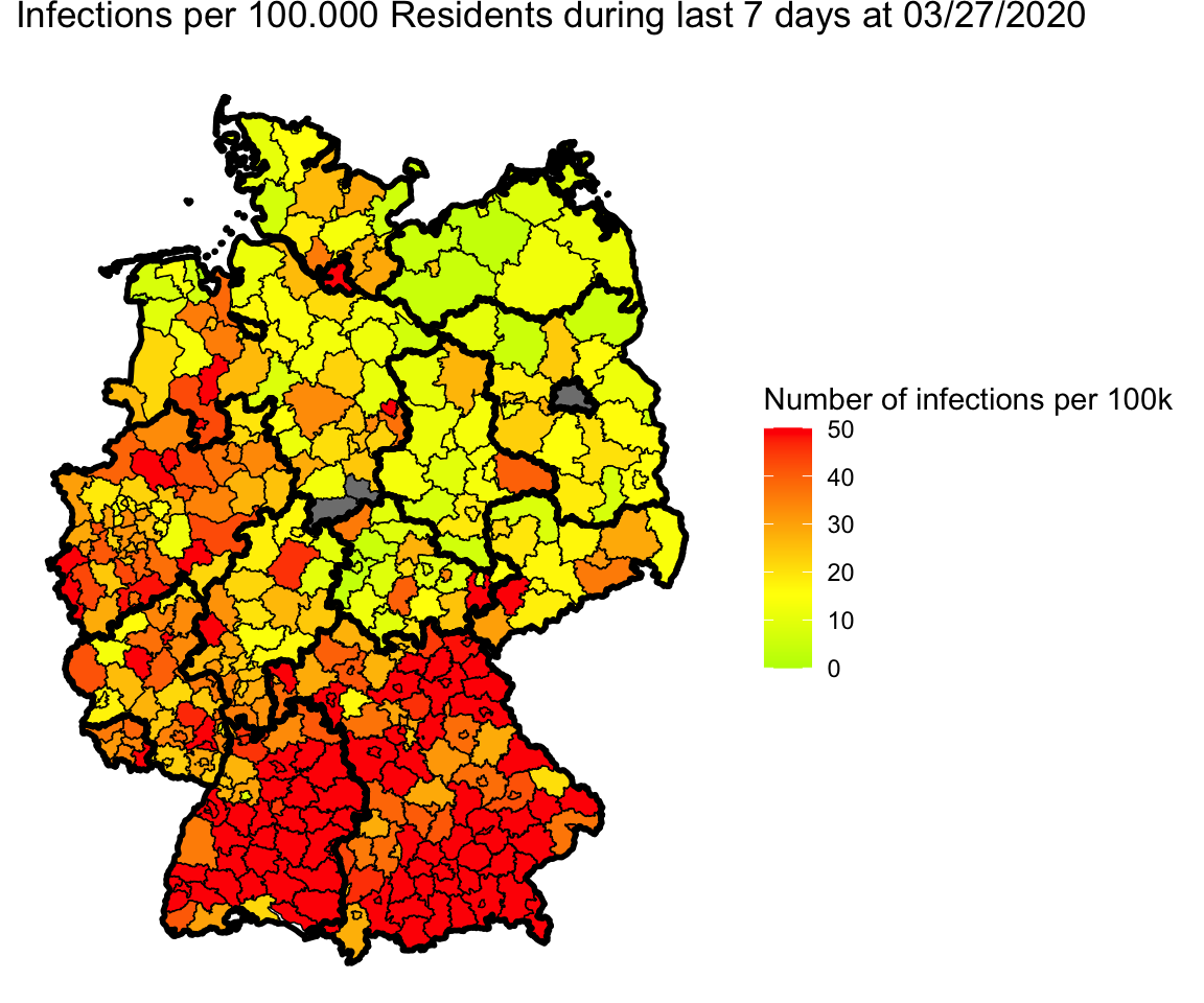
Adjustments for Berlin and Göttingen
Wow, great. But if we take a closer look we see three gray parts:
First, Berlin is gray. The reason is that in Pavel’s data Berlin is split into
several parts. So we have to combine them for plotting.
The other two gray parts are Göttingen in Lower Saxony. I’m not sure were the error is.
Wikipedia lists 03159 as id for Landkreis Göttingen as Pavel does.
R fetches two Landkreise: 03152 and 03156 (Göttingen and Osterorde am Harz
https://gadm.org/maps/DEU/niedersachsen_2.html).
 1
 2
 3
 4
 5
 6
 7
 8
 9
10
11
12
13
14
15
16
17
18
19
20
21
22
23
24
25
26
27
28
29
30
31
32
33
|
# Fix for Göttingen
landkreise.shp.f <- landkreise.shp.f %>%
  mutate(
    id = if_else(id == "03152", "03159", id),  # fix for Göttingen
    id = if_else(id == "03156", "03159", id)  # fix for Göttingen
  )

# Fix for Berlin
data_landkreise_per_day_per_100k <- data_landkreise_per_day_per_100k %>%
  mutate(
    Landkreis = if_else(grepl("Berlin", Landkreis), "Berlin", Landkreis)
  ) %>%
  group_by(MeldedatumKlar, Landkreis) %>%
  summarize(
    infected = sum(infected, na.rm = TRUE),
    infected_7 = sum(infected_7, na.rm = TRUE),
    Bevoelkerung = sum(Bevoelkerung),
    IdLandkreis = first(IdLandkreis)
  ) %>%
  mutate(
    IdLandkreis = if_else(Landkreis == "Berlin", "11000", IdLandkreis),
    infected_7_per_100k = infected_7/ Bevoelkerung * 100000
  )

# Merge data again
plot_date <- ymd("2020-03-27")

mydata <- data_landkreise_per_day_per_100k %>%
  filter(MeldedatumKlar == plot_date) %>%
  rename(id = IdLandkreis)

## merge shape file with data
merge.shp.coef <- full_join(landkreise.shp.f, mydata, by = "id")
|
1
|
single_map(merge.shp.coef, landkreise.shp.f)
|
1
|
## Regions defined for each Polygons
|

Okay, no more blind spots.
Animation for the last 4 days
Let’s use gganimate to plot different days into one map and generate an animated
gif.
 1
 2
 3
 4
 5
 6
 7
 8
 9
10
11
12
13
14
15
|
library(gganimate)

plot_date <- max(data_landkreise_per_day_per_100k$MeldedatumKlar)
days_of_animation <- 3

mydata <- data_landkreise_per_day_per_100k %>%
  filter(MeldedatumKlar >= plot_date - days(days_of_animation)) %>%
  rename(id = IdLandkreis)

## merge shape file with data
merge.shp.coef <- full_join(landkreise.shp.f, mydata, by = "id")

animated_map <- single_map(merge.shp.coef, landkreise.shp.f) +
  transition_manual(MeldedatumKlar) +
  labs(title = "Date: {current_frame}")
|
1
|
## Regions defined for each Polygons
|
1
|
anim_save("map-3-days.gif", animated_map)
|
1
|
## nframes and fps adjusted to match transition
|
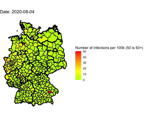
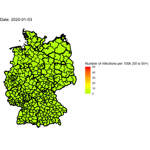
Animate the whole pandemic
The more days are animated the more memory is used to compute the gif. I tried
to animate all data since the start of the pandemic but my 16G of memory weren’t
enough.
So I used only every forth day and waited several minutes:
 1
 2
 3
 4
 5
 6
 7
 8
 9
10
11
12
13
14
|
library(gganimate)

plot_dates <- seq(min(data_landkreise_per_day_per_100k$MeldedatumKlar), max(data_landkreise_per_day_per_100k$MeldedatumKlar), by = 4)

mydata <- data_landkreise_per_day_per_100k %>%
  filter(MeldedatumKlar %in% plot_dates) %>%
  rename(id = IdLandkreis)

## merge shape file with data
merge.shp.coef <- full_join(landkreise.shp.f, mydata, by = "id")

animated_map <- single_map(merge.shp.coef, landkreise.shp.f) +
  transition_manual(MeldedatumKlar) +
  labs(title = "Date: {current_frame}")
|
1
|
## Regions defined for each Polygons
|
1
|
# anim_save("map-all-year.gif", animated_map)
|
Credits
First I’d like to thank Pavel for his work he did creating his daily table.
I learned much about creating maps with ggplot2 following the steps of Thilo Klein’s page