Last week I’ve visualized the spread of Covid-19
through Germany using a map-plot.
Now I was asking myself if there’s a better way to show that the rising number
of infections these day are other than during the local spreadings in June.
So now I want to plot all of the German Landkreise (similar to counties in the U.S.)
regarding the number of new infections during the last 7 days per 100,000 residents
using a histogram.
Getting the data
Once again I’m using the data provided by Pavel Mayer.
I’m processing it mostly the same way I did last week.
1
2
3
4
5
6
7
8
|
# Load Libraries
suppressMessages(library(tidyverse))
suppressMessages(library(lubridate))
suppressMessages(library(zoo))
suppressMessages(library(scales))

# Suppress summarise info
options(dplyr.summarise.inform = FALSE)
|
 1
 2
 3
 4
 5
 6
 7
 8
 9
10
11
12
13
14
15
16
17
18
19
20
21
22
23
24
25
26
27
28
29
30
|
# Fetch the data
url_landkreise_full <- "https://pavelmayer.de/covid/risks/full-data.csv"

if(file.exists("data_landkreise_detail-histogram.Rda")){
  load("data_landkreise_detail-histogram.Rda")
} else{
  data_landkreise_detail <- read_csv(url_landkreise_full, col_types = cols(
    Bundesland = col_character(),
    Landkreis = col_character(),
    Altersgruppe = col_character(),
    Geschlecht = col_character(),
    IdLandkreis = col_character(),
    Datenstand = col_character(),
    Altersgruppe2 = col_character(),
    LandkreisName = col_character(),
    LandkreisTyp = col_character(),
    NeuerFallKlar = col_character(),
    RefdatumKlar = col_character(),
    MeldedatumKlar = col_character(),
    NeuerTodesfallKlar = col_character(),
    missingSinceDay = col_integer(),
    missingCasesInOldRecord = col_integer(),
    poppedUpOnDay = col_integer()
    )
  )
  save(data_landkreise_detail, file = "data_landkreise_detail-histogram.Rda")
}

# Set locale to German because there's the German notation of the weekday used
Sys.setlocale(category = "LC_ALL", locale = "de_DE.UTF-8")
|
1
|
## [1] "de_DE.UTF-8/de_DE.UTF-8/de_DE.UTF-8/C/de_DE.UTF-8/C"
|
 1
 2
 3
 4
 5
 6
 7
 8
 9
10
11
12
13
14
15
16
17
18
19
20
21
22
23
24
25
26
27
28
29
|
# change MeldedatumKlar to date
data_landkreise_detail_converted <- data_landkreise_detail %>%
  mutate(
    MeldedatumKlar = as.Date(
      strptime(MeldedatumKlar, format = "%a, %d.%m.%Y %H:%M")
    )
  )

landkreise <- data_landkreise_detail_converted %>%
  select(Landkreis, IdLandkreis, Bevoelkerung) %>%
  unique()

data_landkreise_per_day <- data_landkreise_detail_converted %>%
  arrange(MeldedatumKlar) %>%
  group_by(Landkreis, MeldedatumKlar) %>%
  summarize(
    infected = sum(AnzahlFall)
  ) %>%
  ungroup() %>%
  complete(MeldedatumKlar = seq(min(MeldedatumKlar), max(MeldedatumKlar), by = "day"), Landkreis, fill = list(infected = 0)) %>%
  arrange(MeldedatumKlar) %>%
  group_by(Landkreis) %>%
  mutate(
    infected_7 = rollsum(infected, 7, fill = NA, align = "right")
  ) %>%
  left_join(landkreise) %>%
  mutate(
    infected_7_per_100k = infected_7/ Bevoelkerung * 100000
  )
|
1
|
## Joining, by = "Landkreis"
|
As you can see I’m using complete in a slightly different way to ensure to get
every date from the very beginning to the last one.
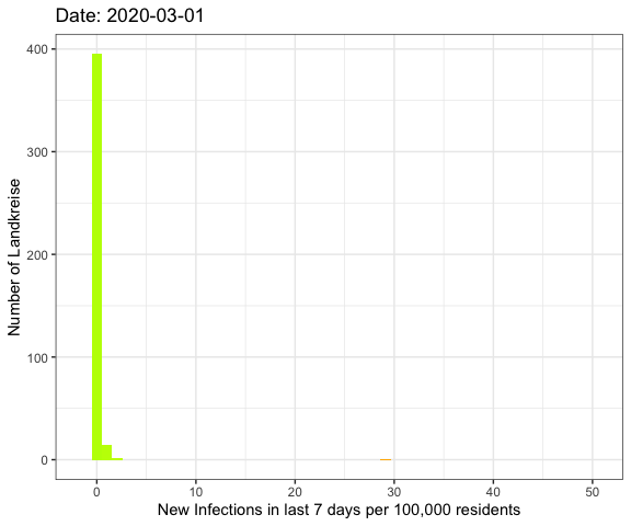
Now let’s prepare the data to fit into a histogram with 0 to 50+ infections on
the x-axis. Therefor I set each landkreis with more than 50 infections to 50.
 1
 2
 3
 4
 5
 6
 7
 8
 9
10
11
12
13
14
15
16
17
18
19
|
data_landkreise_cropped <- data_landkreise_per_day %>%
  filter(MeldedatumKlar >= ymd("2020-03-01")) %>%
  rowwise() %>%
  mutate(
    infected_7_per_100k_plot = min(infected_7_per_100k, 50)
  ) %>%
  ungroup()

get_histogram <- function(data) {
  ggplot(data) +
  geom_histogram(aes(x = infected_7_per_100k_plot, fill = ..x..), bins = 50) +
  scale_fill_gradient2(midpoint = 15, low = "green", mid = "yellow",
                          high = "red", space = "Lab", limits=c(0, 50), oob=squish,
                         name = "Number of infections per 100k (50 is 50+)") +
  guides(fill = FALSE) +
  xlab("New Infections in last 7 days per 100,000 residents") +
  ylab("Number of Landkreise") +
  theme_bw()
}
|
The result
So let’s compare the June event with the current data:
1
2
|
get_histogram(data_landkreise_cropped %>% filter(MeldedatumKlar %in% c(ymd("2020-06-23"), ymd("2020-08-14")))) +
  facet_wrap(~MeldedatumKlar)
|
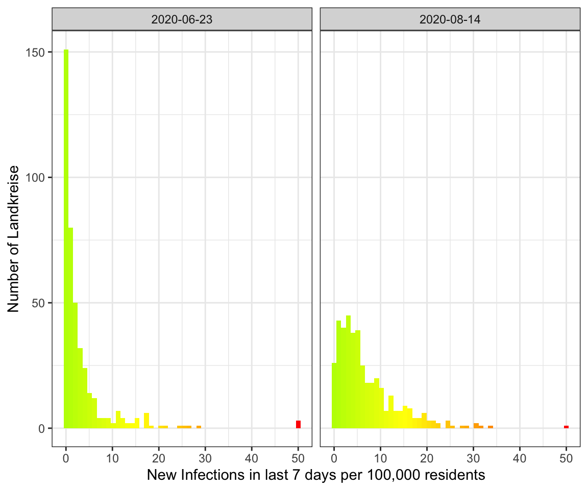
As you can see the peak in August is much broader with more Landkreise with
more infections. In June on the other hand there were a lot more Landkreise with
a few or no infections.
The whole pandemic
Let’s do an animation of the whole pandemic again.
1
2
3
4
5
6
7
|
library(gganimate)
anim <- get_histogram(data_landkreise_cropped) +
  transition_manual(MeldedatumKlar) +
  labs(title = "Date: {current_frame}")

animated_histogram <- animate(anim, fps = 5, end_pause = 15)
anim_save("histogram-all-year.gif", animated_histogram)
|
Note
I’ve got a comment to my last visualization to use different colours such as the viridis scale
because red-green colour blindness is very common.
So I tried it here.
1
2
3
|
get_histogram(data_landkreise_cropped %>% filter(MeldedatumKlar %in% c(ymd("2020-06-23"), ymd("2020-08-14")))) +
  facet_wrap(~MeldedatumKlar) +
   scale_fill_viridis_c()
|
1
2
|
## Scale for 'fill' is already present. Adding another scale for 'fill', which
## will replace the existing scale.
|
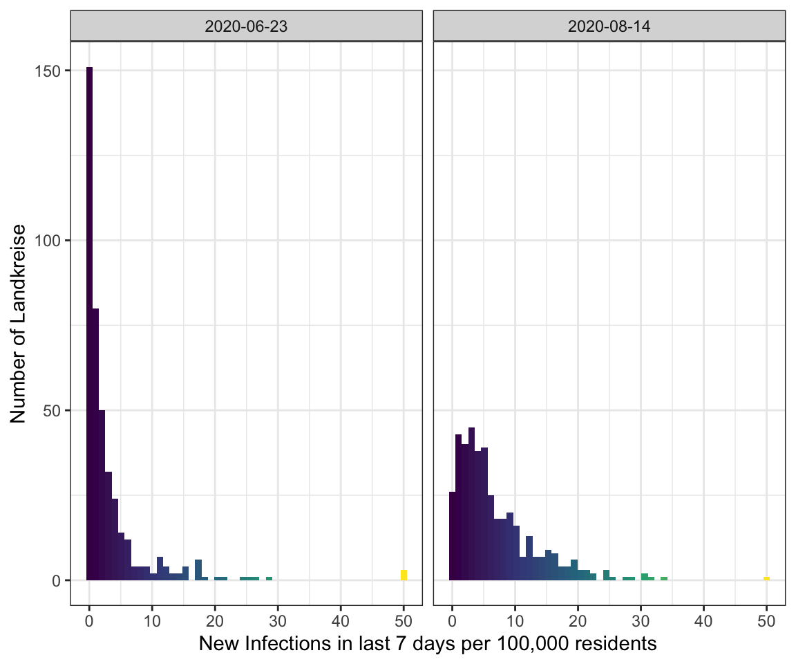
But I think in this special case green - yellow - red is the better choice because
even if you can’t distinghuish between them the position in the plot will be enough
to get the right value.
However, the maps of last week would be better with viridis.