Sorting German Numbers in DT datatable
DT::datatable() is a great way to show interactive tables in RMarkdown documents.
(Unfortunately it’s a little bit tricky to use them with blogdown in combination
with some hugo themes. But that’s another story.)
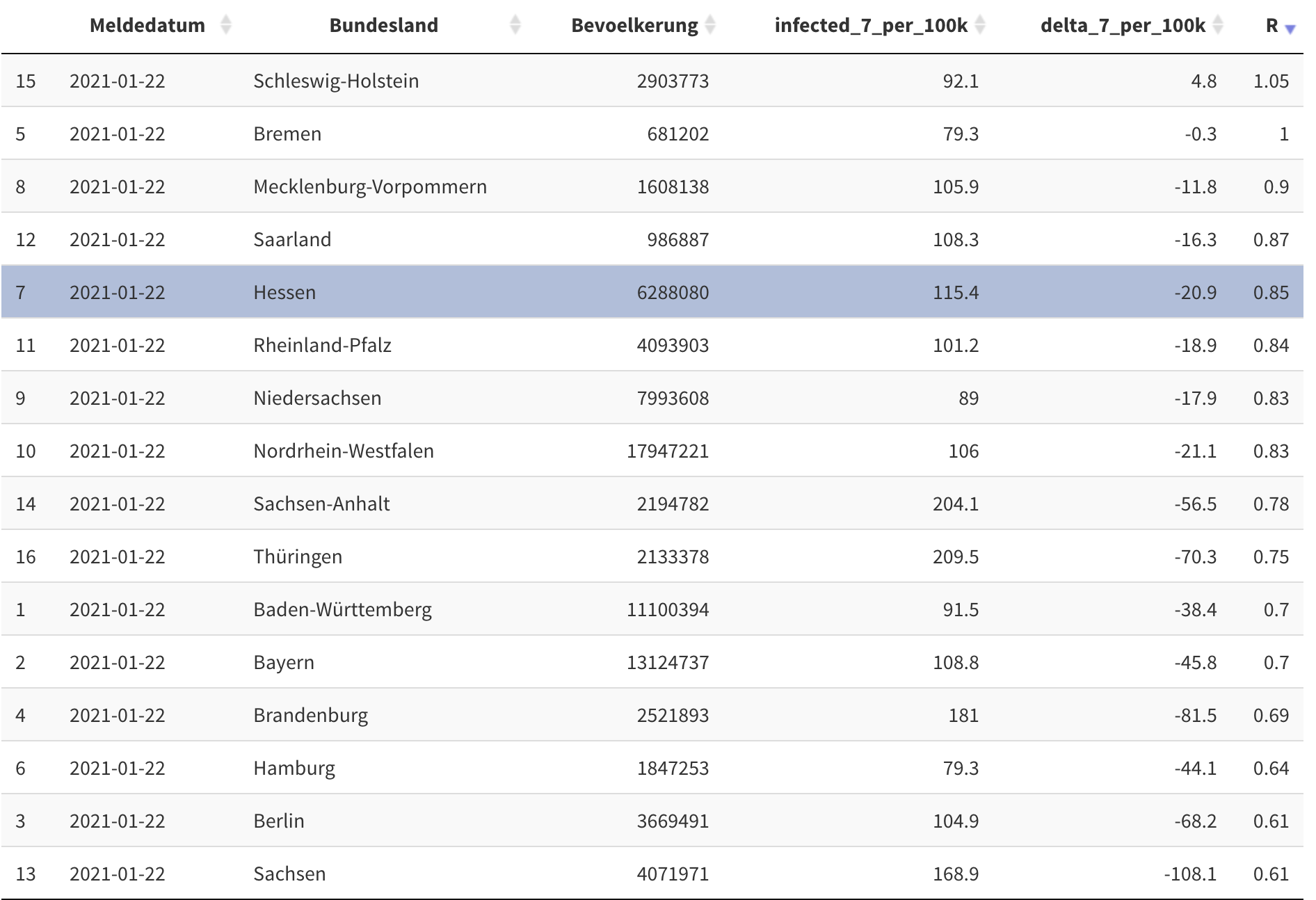
The user can sort any column as he wants to. But it’s an English tool. Numbers are formated in the American or English way: As decimal mark a point is used and between thousands a comma is used as separator. So it’s $ 1,234,567.89 $
In Germany both characters are switched: It’s $ 1.234.567,89 $.
You can format columns in DT::datatable() using the function formatRound() and
its parameters interval, mark and dec.mark.
But this breaks the sorting. Let’s have a look.