Shiny-App to Explore SARS-CoV-2 in Germany
Contents
I’ve visualized the Covid-19 data I’ve got from Pavel Mayer in different ways ( see https://www.rstats-tips.net/2020/08/16/additional-visualization-of-covid-19-development-in-germany/ or https://www.rstats-tips.net/2020/08/09/visualization-of-corona-incidence-in-germany-per-county/ )
But I always wanted to make it more interactive. So I decided to build a Shiny-App.
So what can you do with this app?
What can I do with the App?
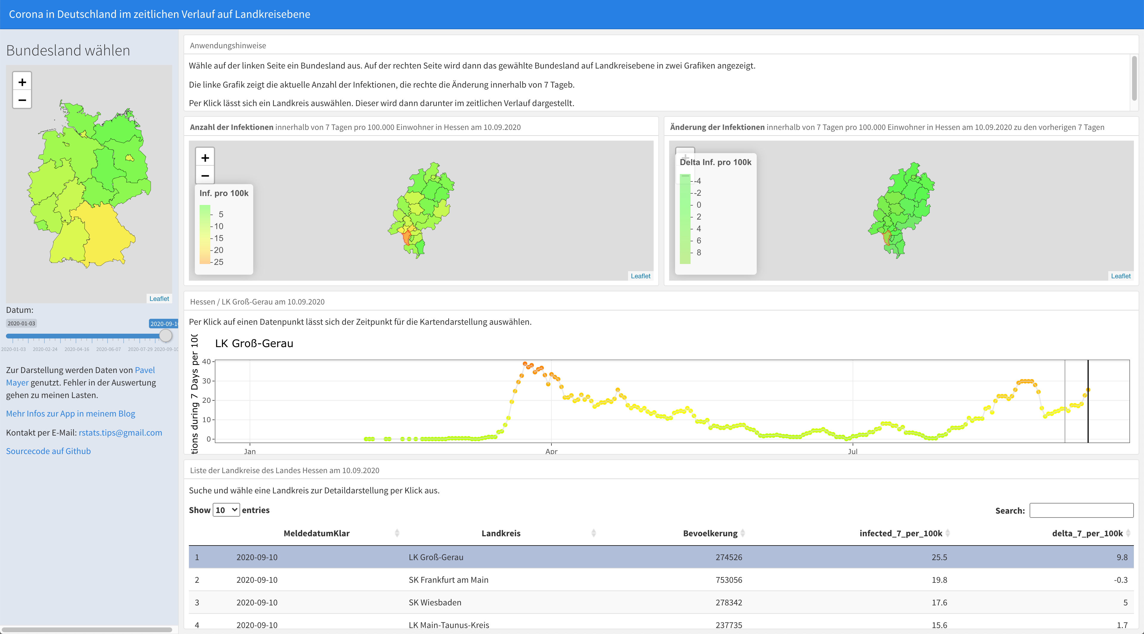
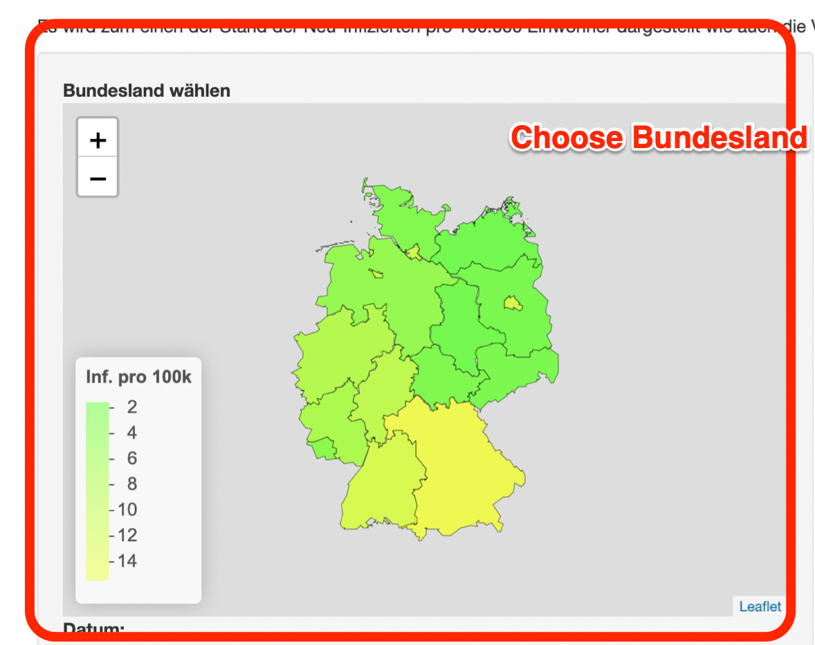
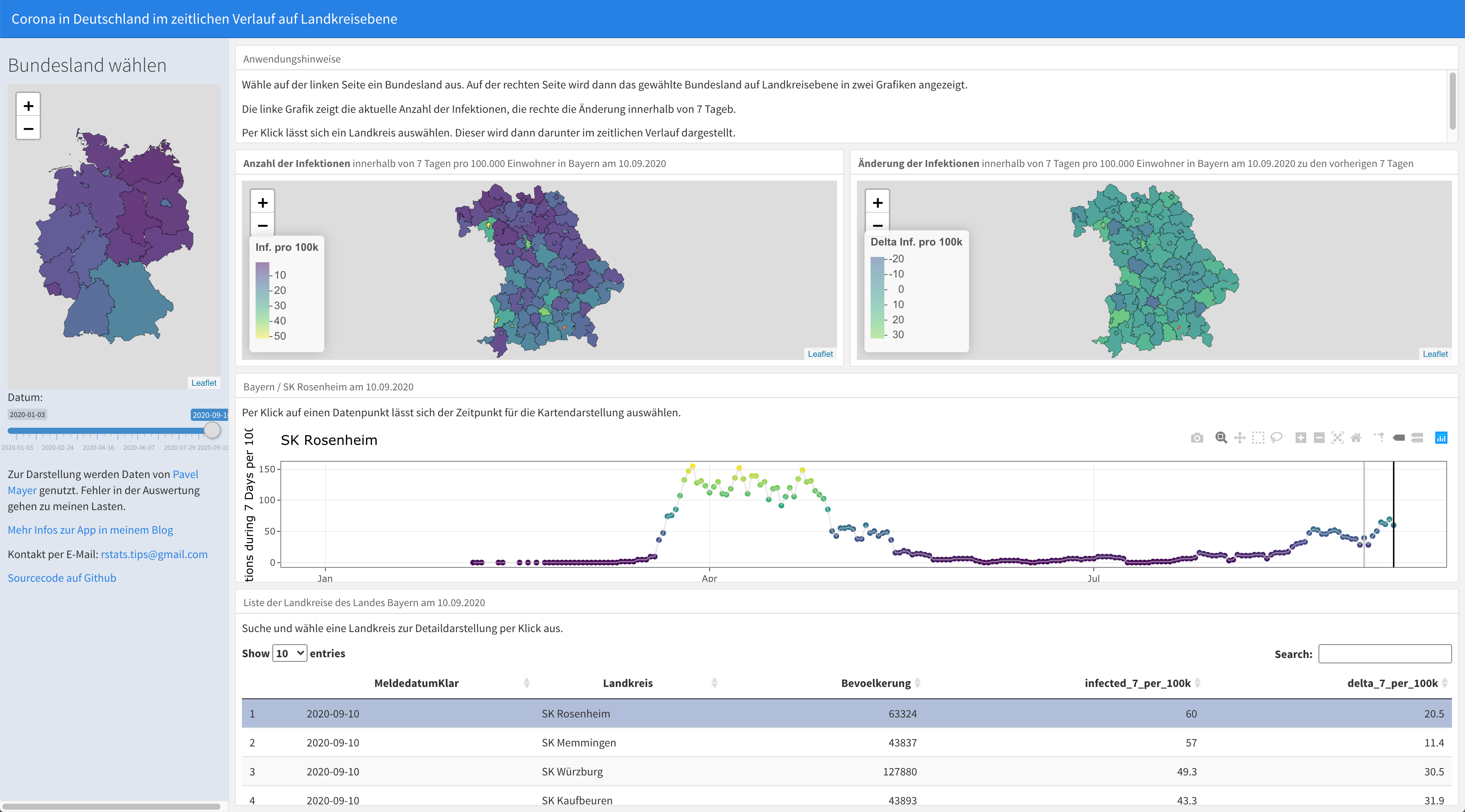
When you start the app you see Germany on the left side with its 16 Bundesländer. Each Bundesland is colored regarding its value for New Infections during the last 7 Days per 100,000 residents.
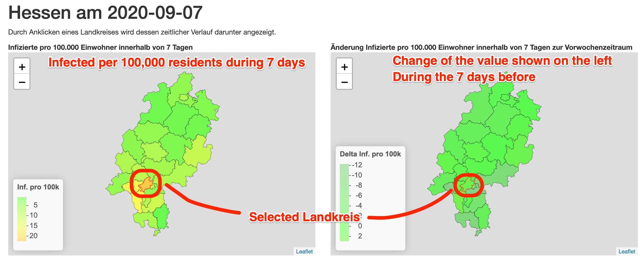
On the right side you can see the selected Bundesland in two ways:
- The left side shows New Infections during the last 7 Days per 100,000 residents per Landkreis.
- The right plot shows the Change in the last 7 Days of New Infections during the last 7 Days per 100,000 residents per Landkreis.
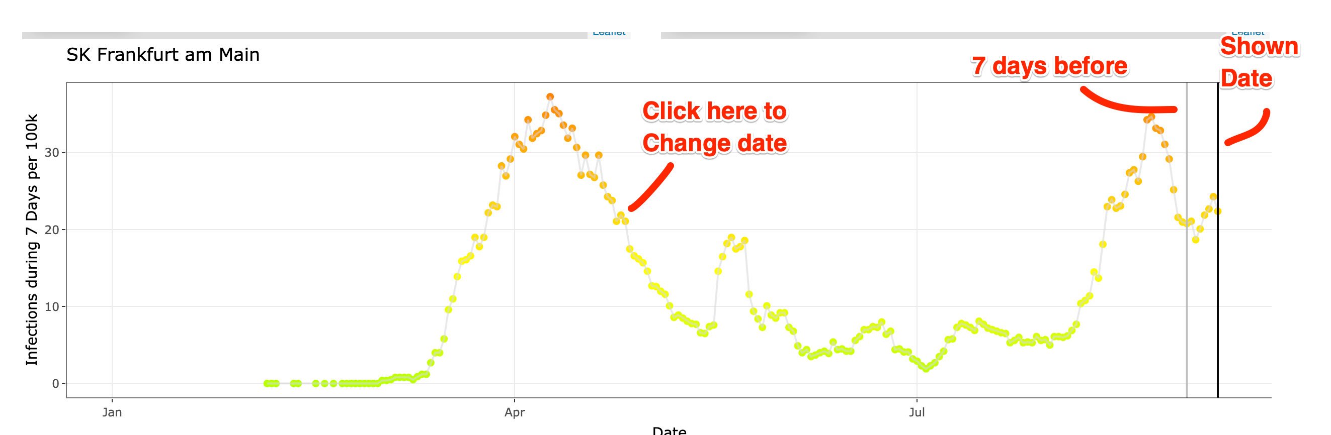
Below these two maps you can see a line plot for the selected Landkreis showing the evolution over time. If you click on a data point you can change the date shown in the maps.
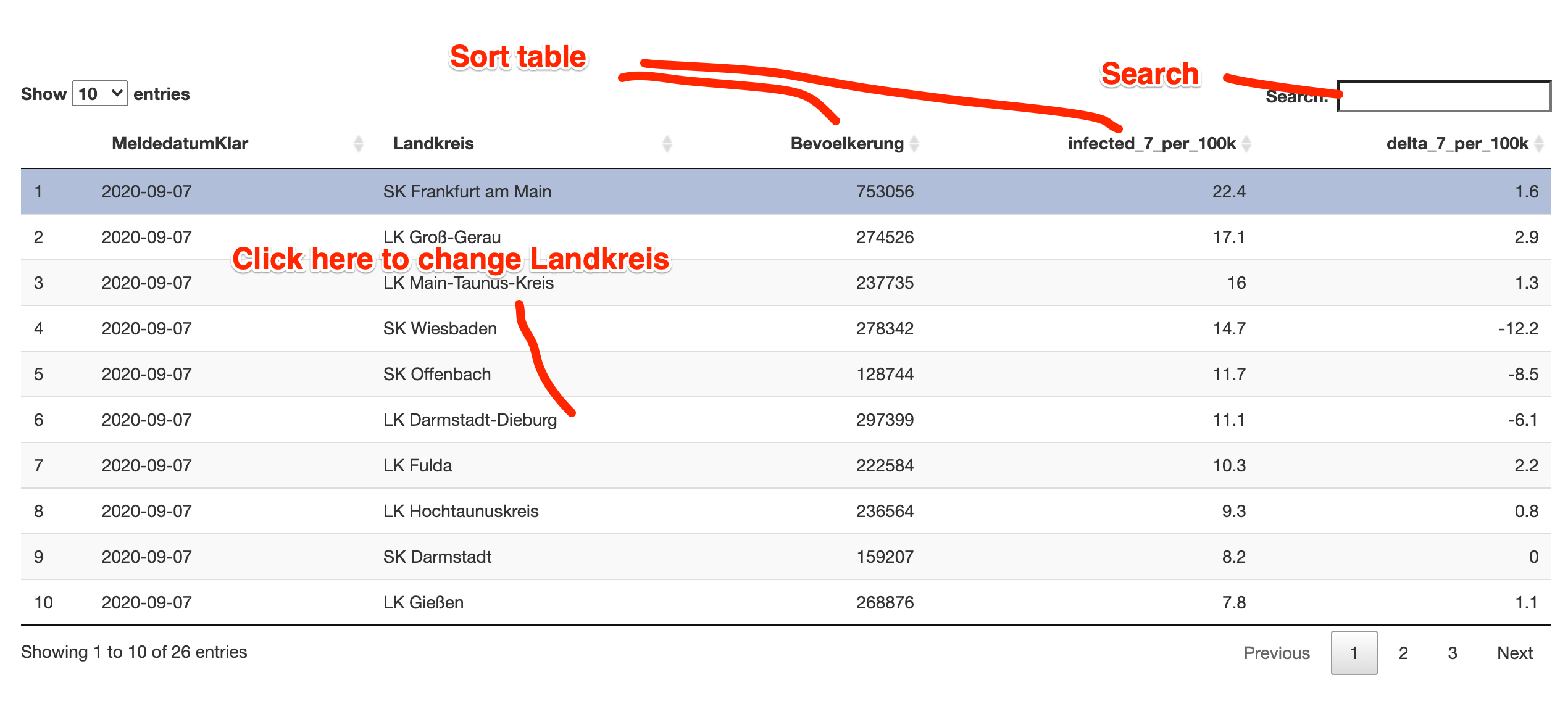
At the bottom you can see a table with all Landkreise of the selected Bundesland. Here you can select a Landkreis, too. You can search and sort the table.
Version for colorblindness
I’ve also deployed an app version using another colorscale for people with colorblindness.
Launch this version of the app
Updates
Please read also this aricle
Can I get the source code?
The source code is published at github.