Shiny-App to Explore SARS-CoV-2 in Germany
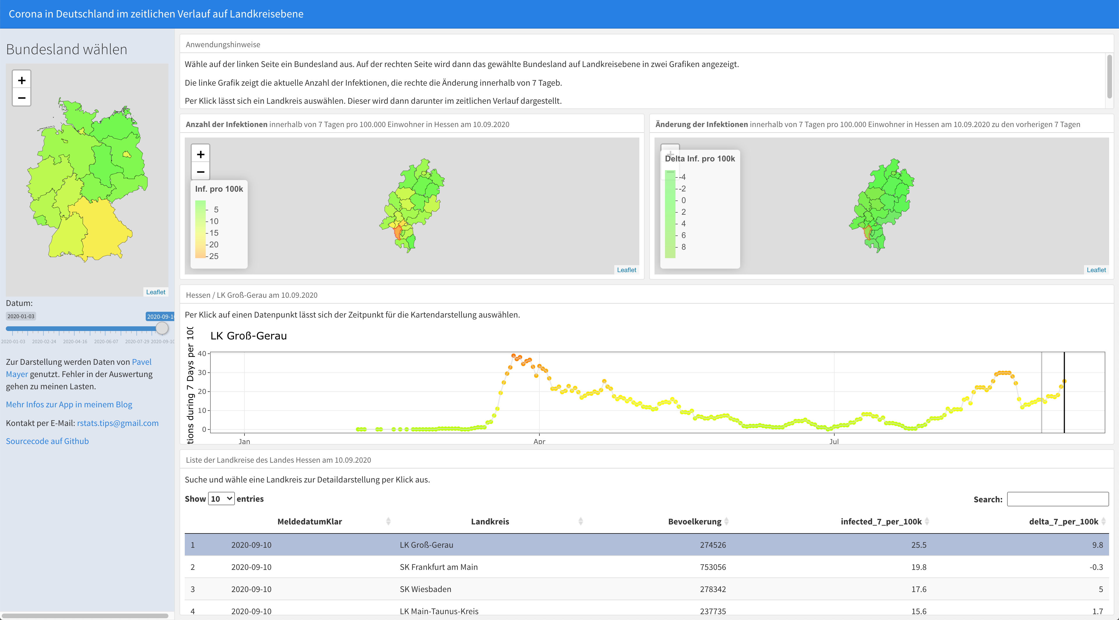
I’ve visualized the Covid-19 data I’ve got from Pavel Mayer in different ways ( see https://www.rstats-tips.net/2020/08/16/additional-visualization-of-covid-19-development-in-germany/ or https://www.rstats-tips.net/2020/08/09/visualization-of-corona-incidence-in-germany-per-county/ )
But I always wanted to make it more interactive. So I decided to build a Shiny-App.
So what can you do with this app?