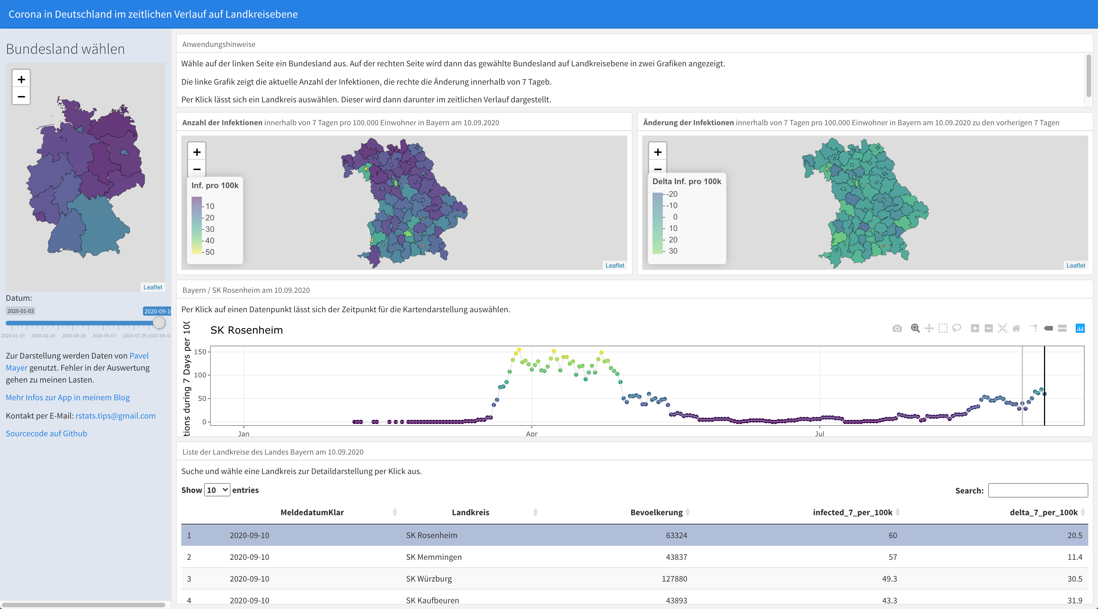
Update of SARS-CoV-2 Shiny App
I’ve updated my Shiny-App.
Now you can switch between Bundesländer and Landkreise:
I’ve updated my Shiny-App.
Now you can switch between Bundesländer and Landkreise:
dplyr is a wonderful package for data wrangling. It’s far more useful than pandas at the python front.
There’s also a constant development to make this package even more useful. If you want to see what you can do with the latest version I suggest you have a look at this awesome article with examples.
I’ve enjoyed reading it.
Today I’ve updated my Shiny App I wrote about a few days ago.
I’m using now Flexdashboard to embed a shiny app into an Rmarkdown-File.
I’ve visualized the Covid-19 data I’ve got from Pavel Mayer in different ways ( see https://www.rstats-tips.net/2020/08/16/additional-visualization-of-covid-19-development-in-germany/ or https://www.rstats-tips.net/2020/08/09/visualization-of-corona-incidence-in-germany-per-county/ )
But I always wanted to make it more interactive. So I decided to build a Shiny-App.
So what can you do with this app?
Last week I’ve visualized the spread of Covid-19 through Germany using a map-plot.
Now I was asking myself if there’s a better way to show that the rising number of infections these day are other than during the local spreadings in June.
So now I want to plot all of the German Landkreise (similar to counties in the U.S.) regarding the number of new infections during the last 7 days per 100,000 residents using a histogram.